How the US Air Force Ditched the "Average" and Saved Lives
The average is the most commonly used metric we use to understand data and infer insights - it is also the most dangerous.

The Pitfall of the Average
The US Air Force began life in the late 1940s with a high rate of aircraft accidents and pilot fatalities (excluding combat losses) with 23.6 aircraft destroyed per 100,000 flying hours. This dramatically reduced to 4.3 by the end of the 1960s driven largely by the work of one man, Lieutenant Gilbert S. Daniels who saw the pitfall of using “the average” to design solutions.
The tendency to think in terms of the “average man” is a pitfall…it is virtually impossible to find an “average man” in the Air Force population. Gilbert S Daniels (1952 US Air Force Report)
US Army engineers had standardised the design of pilot cockpits to conform to the average dimensions of a 1926 pilot. This was revisited in the 1950s by Lt. Daniels who measured the bodily dimensions of more than 4,000 pilots and found that zero pilots matched the average dimensions.
The US Air Force responded and demanded that its manufacturers design its cockpits to be adjustable to individual dimensions vs the standardised average. As a consequence, both pilot performance and accident/ mishap rates dramatically improved.

A Modern Example
A modern example of the pitfall of the average would be to look at user activity. Imagine we build software that helps users perform inspections and we are tasked with improving user engagement.
Looking at the data we find that the average count of monthly inspections performed by our active users is 32 inspections per month:
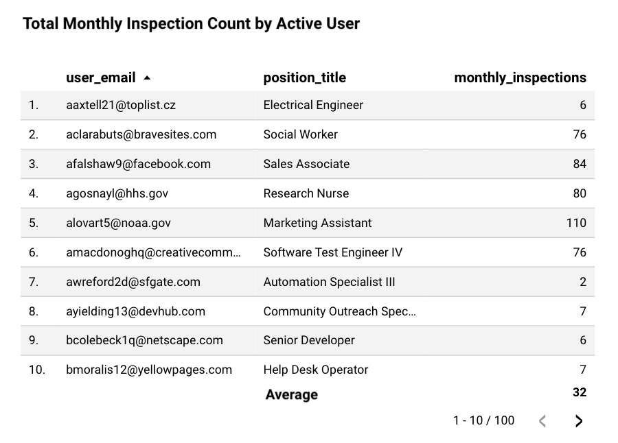
Knowing this, we can deduce that our users on average perform 32 inspections per month or approximately one inspection a day. We begin building solutions such as daily notifications to help remind our users to perform their daily inspection.
Stop.
Reducing a large data set into a single number can often mask useful information and give us the wrong answer. Instead we can look at the distribution of our data and graph the same data as a histogram to reveal how often each different value occurs in a dataset.
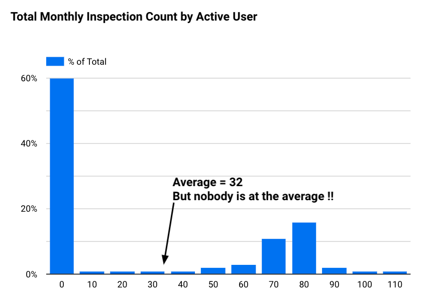
Now looking at the distribution of our data we can see that none of our users perform the average number of 32 inspections per month. Instead we see that 60% of our users perform 10 or fewer inspections per month and a large group (+30% of users) perform 70 or more inspections per month.
The distribution of our data could suggest that the usage of our software differs widely by different cohorts of users. One cohort could be using it to perform monthly scheduled safety checks vs another cohort using it to perform factory line QA checks.
Next time when using the average, pause before making any conclusions and ask: "How many instances of the data actually reflect the average?".
References:
Want more tips?
Get future posts with actionable tips in under 5 minutes and a bonus cheat sheet on '10 Biases Everyone Should Know'.
Your email stays private. No ads ever. Unsubscribe anytime.
My other project
Investor Tool
World's largest tech companies