User Interface Design: 5 Rules of Thumb
2 minute read | Dec 22, 2022
product
Here are five rules of thumb you can apply to common UI design challenges when building web applications:
1. Use defaults
Provide default values to guide users on the most common choices or behaviour you want to encourage.
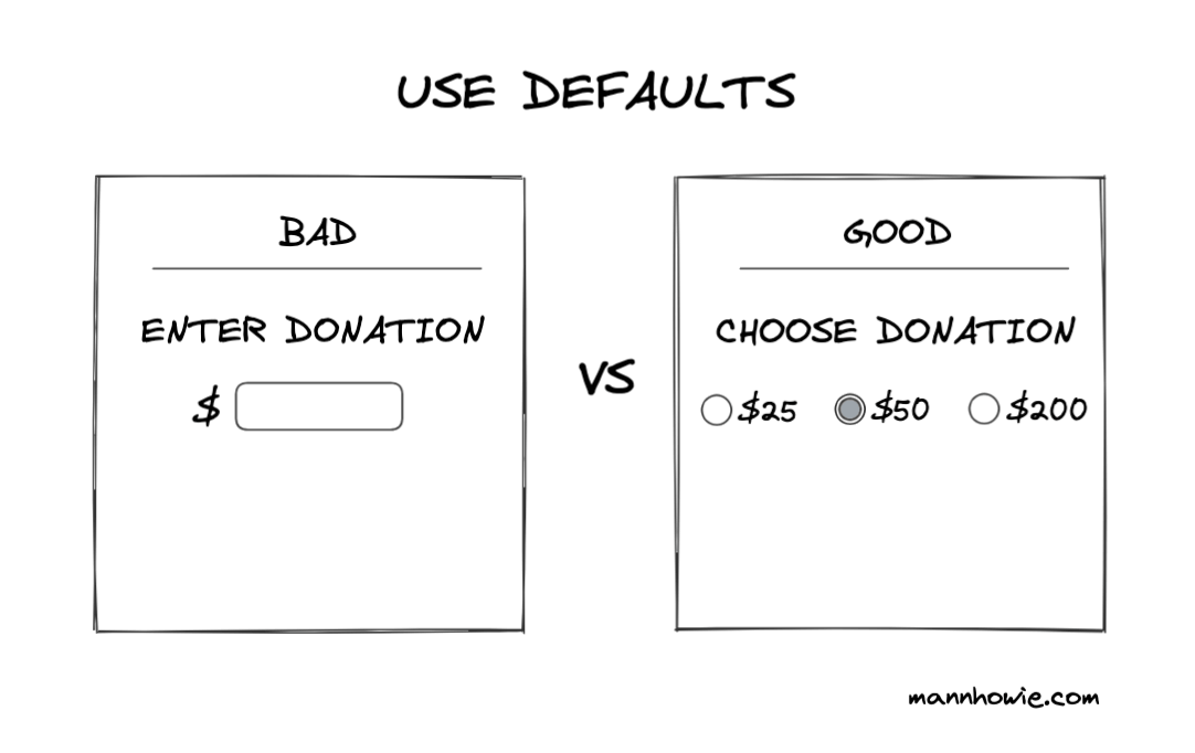
Defaults reduce the number of choices and decision fatigue users must face. They provide context as to the next decision required. Attempt to reduce the number of inputs you require by collapsing optional values.
2. Obvious settings
Settings should be obvious and unambiguous. Use radio buttons or checkboxes to indicate whether a setting is active. Where possible opt for binary settings instead of multiple states (e.g. flash mode on/ off vs flash mode auto, on or off).
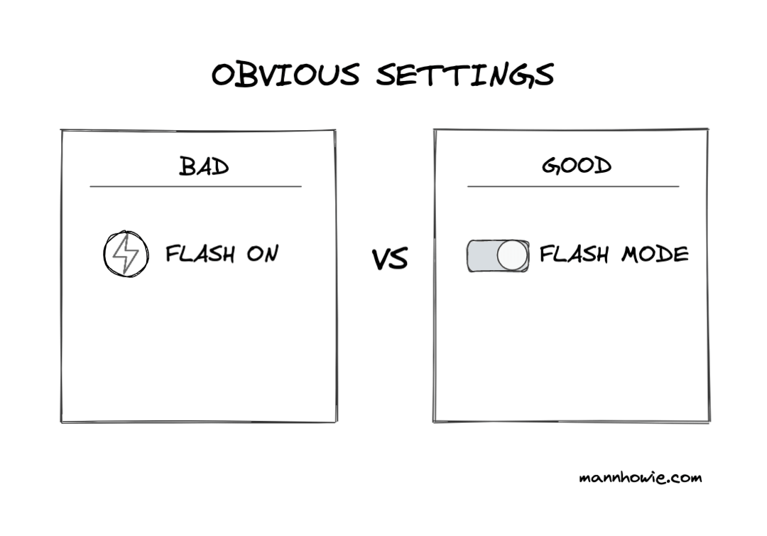
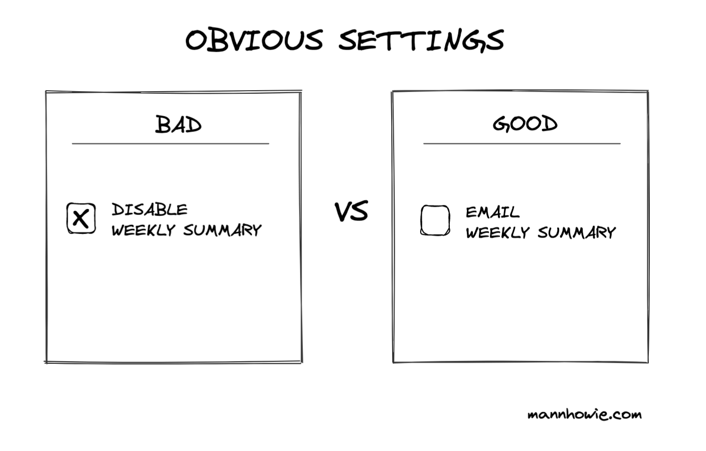
Clearly label preference settings with positive active labels. Avoid negative labels. Checkboxes should enable things, not disable them.
3. Show progress
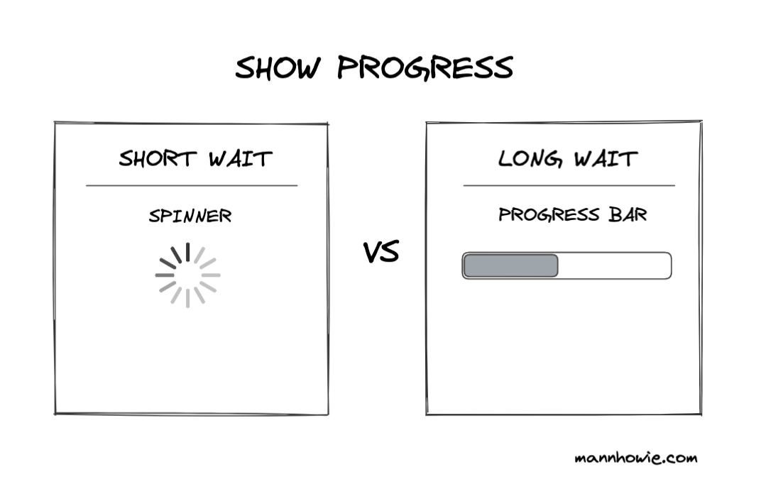
Feedback should be immediate to communicate to users that the action has been received. When feedback cannot be immediate, use loading spinners for short waits (<10 seconds) and progress loaders for long waits (>10 seconds).
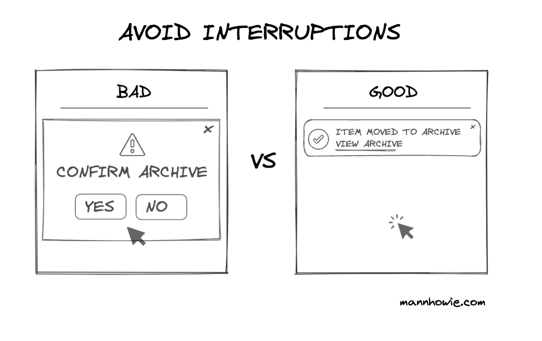
4. Avoid interruptions
Avoid interrupting users' workflow by making decisions to allow slips with ways to undo. Allow slips with the use of less intrusive toasts vs intrusive warning confirm modals.
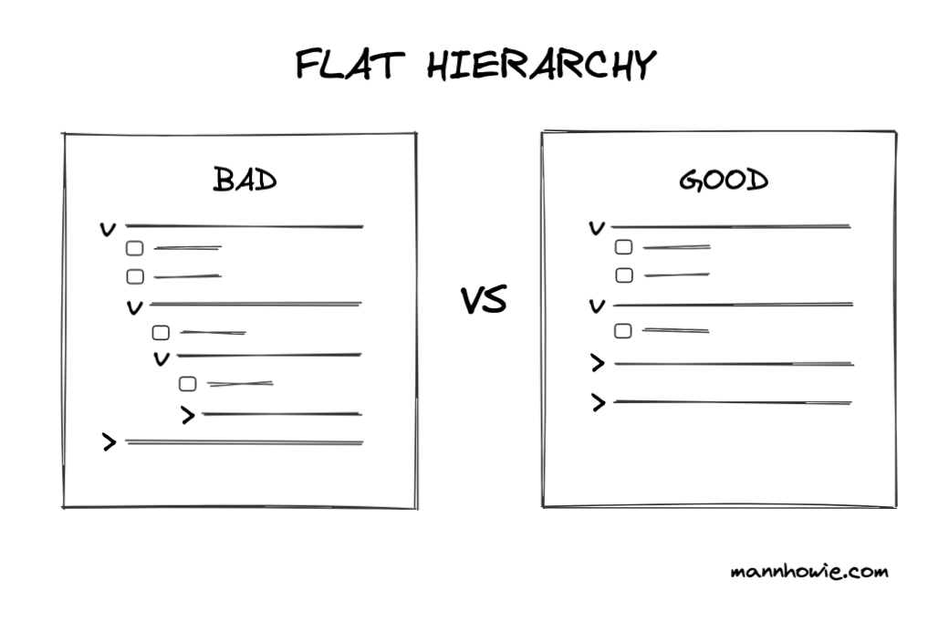
5. Flat hierarchy
Use flat instead of deep hierarchies. Content is more discoverable if it is not deeply nested inside hierarchies. People are good at naturally grouping categories based on labels without relying on deep nesting.
References
Want more tips?
Get future posts with actionable tips in under 5 minutes and a bonus cheat sheet on '10 Biases Everyone Should Know'.
Your email stays private. No ads ever. Unsubscribe anytime.
My other project
Investor Tool
World's largest tech companies