Chart Formatting: 5 Best Practices
2 minute read | Jun 23, 2023
finance
Here are five formatting tips to follow when presenting with charts:
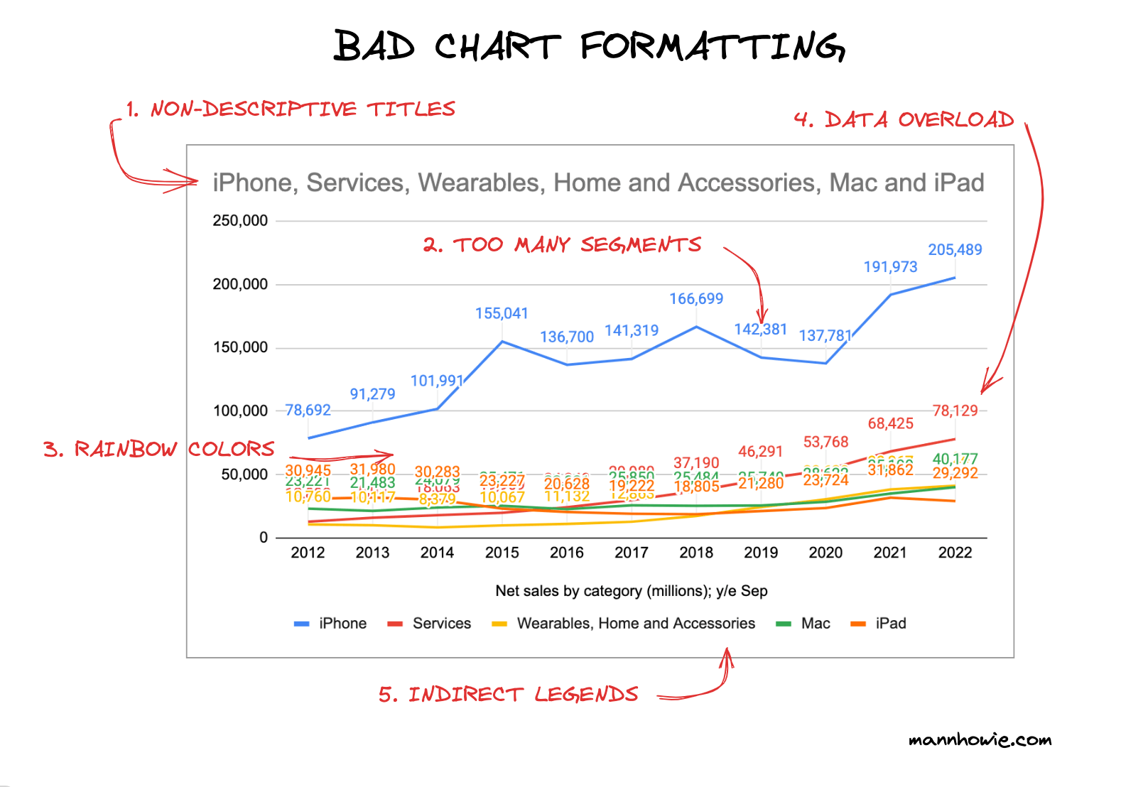
Below are examples of good and bad chart formatting practices:
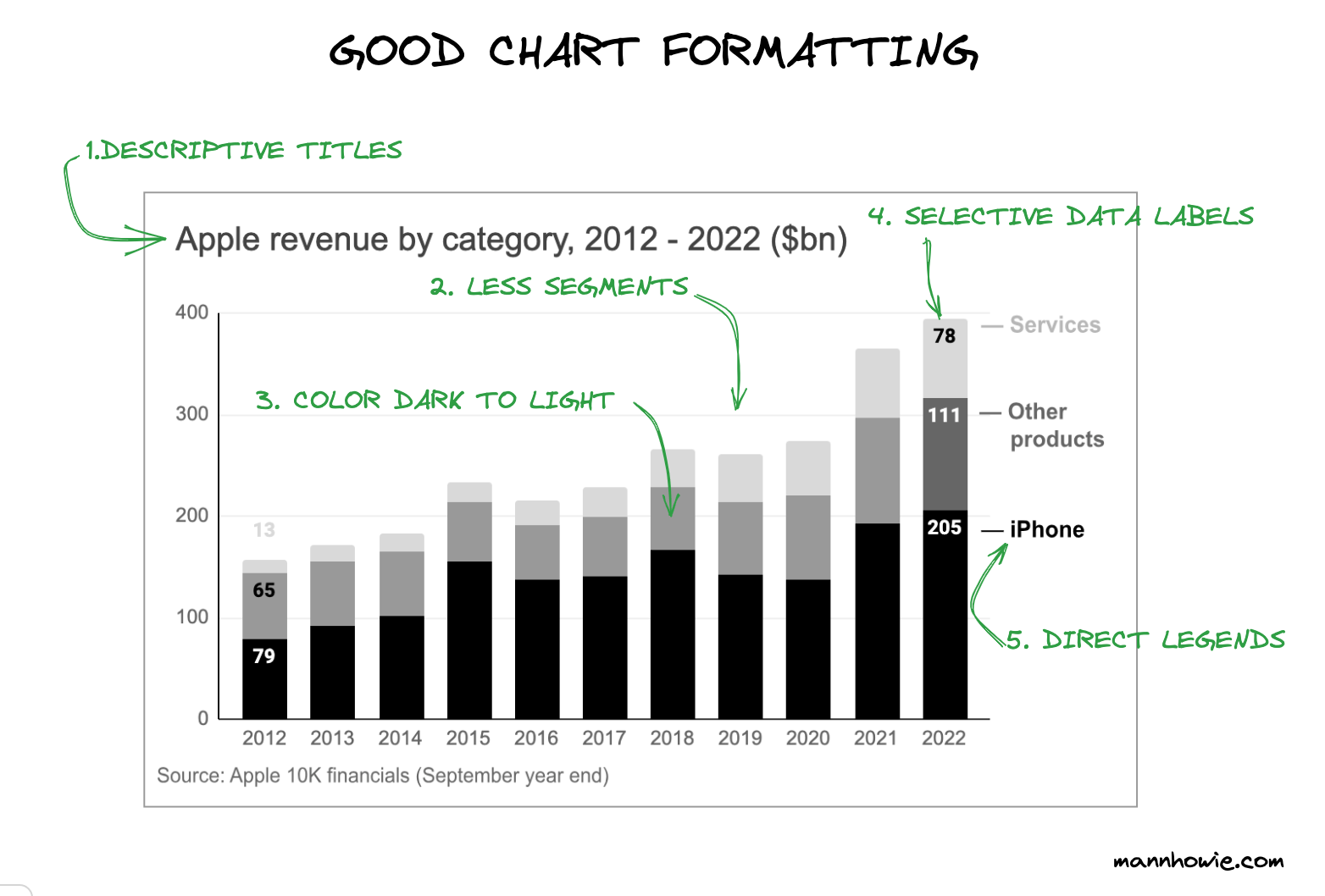
1. Descriptive Titles
Your chart title should clearly explain what you are measuring.
Bad practice: "Revenue Split"
Good practice: "Apple Revenue by Category, 2012 - 2022 ($bn)"
A good chart title should include:
- Subject: The entity being measured. For example, Apple
- Metric: The specific measurement and dimensions. For example, revenue by category
- Time period: The interval being measured. For example, 2012 - 2022
- Unit of measurement: The units in which the data is measured. For example, ($bn)
2. Fewer Segments
Limit your data to fewer segments that align with the narrative you're telling.
Bad practice: A line chart showing Apple's annual revenue split by five categories: iPhone, Mac, iPad, Wearables, Home & Accessories, and Services.
Good practice: A stacked bar chart dividing Apple's annual revenue into three categories: iPhone, Other Products, and Services.
3. Color from Dark to Light
Use sequential color palettes, moving from dark to light, to convey a visual hierarchy.
Bad practice: Using unrelated or illogically ordered colors, such as rainbow color schemes.
Good practice: Using a uniform color scheme, with light colors for low data values and dark colors for high values.
4. Selective Data Labels
Choose which data points to label selectively to avoid clutter.
Bad practice: Labelling every single data point in a line chart with dozens of data points, leading to clutter.
Good practice: Only labelling the starting and ending values to communicate the change in data over time.
5. Direct Legends
Place legends close to the data they represent for easy reference. If there's only one category, omit the legend and rely on the chart title.
Bad practice: Positioning a single legend far from the data or using complex keys requiring constant cross-referencing.
Good practice: When possible, place labels directly on or next to the data points or bars they describe.
Want more tips?
Get future posts with actionable tips in under 5 minutes and a bonus cheat sheet on '10 Biases Everyone Should Know'.
Your email stays private. No ads ever. Unsubscribe anytime.
My other project
Investor Tool
World's largest tech companies