4 Key Charts - When and How to Use Them
5 minute read | Jun 17, 2023
finance, management
Learn when and how to use these four key charts including best practices.
1. Column Chart
Use column charts when you need to quickly compare data across different categories side-by-side.
 Examples
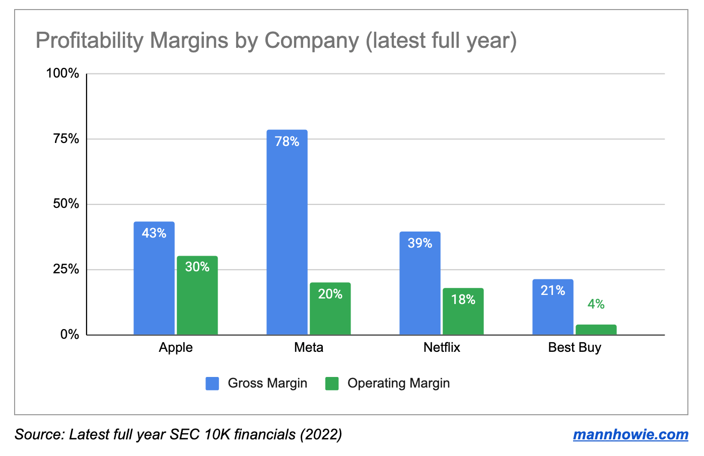
- Profitability margins: compare profit margins across different companies. Use multiple columns (known as clustered column chart) to compare multiple metrics per company such as gross margin and operating margins (see above).
- Employee performance: compare customer ratings, renewal rates, revenue ownership across different customer success team members or regional departments.
- Feature usage: compare Monthly Active User (MAU) engagement by product feature category using total MAU or % of MAU. In this example a column chart is better vs pie graph as the users are not mutually exclusive by feature.
Best Practices
- Consider the order of your data: rank your categories from best to worst, put the best on the left and the worst on the right. The highest value is not always the best. For example, customer complaints per employee.
- Use stacked column charts: stacked column charts are useful when comparing composition breakdown across many categories. For example, looking at the split between Domestic vs International revenues between listed companies. Limit stacked column categories to max three.
- Add data labels: when comparing many different categories, add data labels to specific categories you want to highlight.
2. Line Chart
Use line charts when you have time series data and want to see trends over time.
 Examples
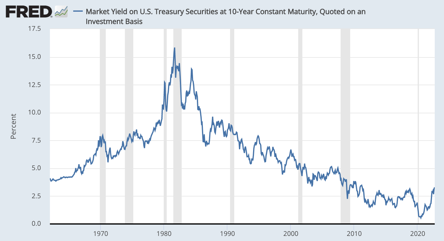
- Financial data: track central bank interest rate changes on a monthly basis over multiple decades (see above).
- User growth: track Monthly Active Users (MAUs) on a 30 day rolling basis using a daily interval across a 12 month period
- Revenue growth: track monthly Annual Recurring Revenue (ARR) using a monthly interval across a 12 or 24 month period
- Customer satisfaction: track Net Promoter Score (NPS) on a 90 day rolling basis using a daily interval across a 12 month period
Best Practices
- Choose the right period: choose the right x-axis time period to match the story you are presenting. For example, when presenting seasonal data such as monthly retail sales use a 12 month period. When presenting daily data such as website traffic use a one month period.
- Use benchmarks: when relevant, include a secondary dataset and line that provides a benchmark performance. For example, when comparing NPS include the previous year figures to compare. When comparing quarterly churn include industry churn figures as a fixed-line benchmark.
- Don’t plot too many lines: limit to four or less lines including benchmarks. Don’t overload your line chart.
3. Pie Graph
Use pie graphs when you want to display the proportion of parts to a whole, expressed in percentages.
 Examples
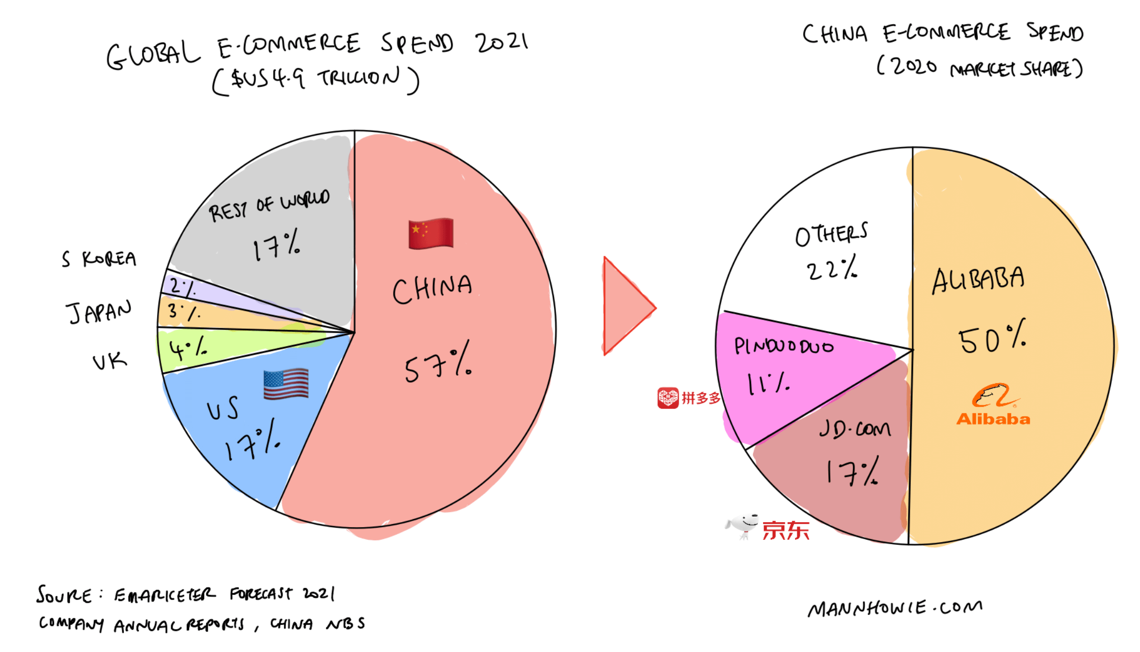
- Market share: show the global revenue market share of e-commerce spend by country and sub-grouped by company for the largest country (China) (see above).
- Revenue streams: showcase the proportion of total revenue coming from different products or services.
- User segmentation: reveal the distribution of user types, like paying vs non-paying users or split by region.
Best Practices
- Limit your segments: too many segments can make a pie chart unreadable. Try to limit it to 5-7 segments, and group smaller segments together into an 'other' category if needed.
- Label using percentages: pie charts are designed to show what percentage each part contributes to the whole. Don’t clutter your graph by adding raw numbers.
- Use it for positive values only: only use pie charts when your data is all positive. For instance, when representing assets or liabilities in a balance sheet, use separate pie charts.
4. Data Table
While not a traditional chart, data tables are a powerful tool for presenting detailed, numeric information. They allow for precise data comparison and are less prone to data visualization bias.
 Examples
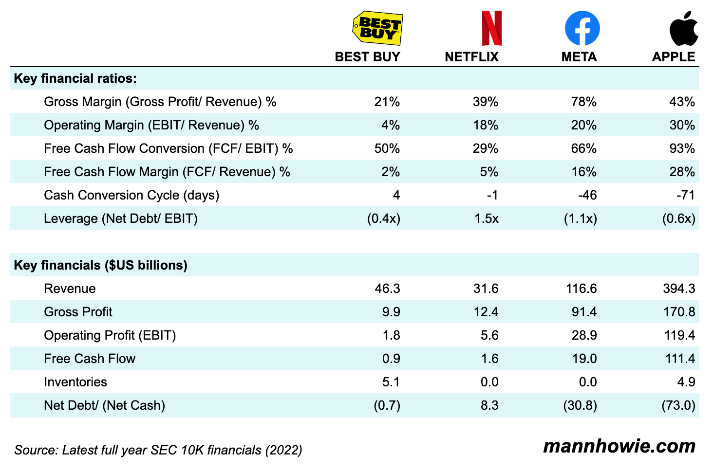
- Financial metrics: present key financial metrics and ratios in a table comparing against different companies. Here, a data table can present a more complete financial performance vs a single chart (see above).
- Key Performance Indicators (KPIs): track multiple KPIs in a single table. For example, New ARR, Churn, MAU, NPS. Consider adding another column under each KPI highlighting the target for the quarter or year.
- Customer account metrics: showcase detailed breakdown of key metrics by customer account. For example, ARR, renewal dates, region, account manager, customer health score.
Best Practices
- Keep it simple: limit your table to the most relevant metrics to keep it readable.
- Use clear labels: each column and row should have a clear, concise label. If you need to include units (like % or $), be consistent in your use.
- Order your data logically: whether you're sorting by time period, in alphabetical order, or by numerical value, make sure your data follows a logical sequence.
Want more tips?
Get future posts with actionable tips in under 5 minutes and a bonus cheat sheet on '10 Biases Everyone Should Know'.
Your email stays private. No ads ever. Unsubscribe anytime.
My other project
Investor Tool
World's largest tech companies