5 Key UX Design Principles - How to Make Products User Friendly
6 minute read | Jan 17, 2021
product
By recognizing the 5 key principles of User Experience (UX) design as popularised by Don Norman, you will be able to see thoughtful vs bad design:
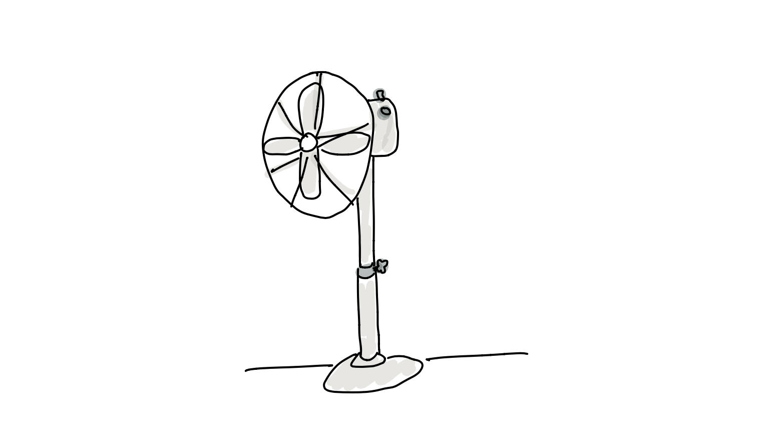
First let me tell you about my pedestal fan. Then, we will apply these principles to look at how YouTube designs their hugely popular mobile app.
1. Affordances
My fan has the basic affordances of:
- Blowing air by rotating its blades;
- Adjusting height;
- Changing speed; and
- Auto swivelling
Affordances represent how a person can interact with an object. The relevant person here matters. The controls and blades are at the top of the fan meaning a child can’t reach. The affordance only exists for people above a certain height.
2. Signifiers
My fan has three signifiers that influence its features:
- A screw handle for adjusting height
- A knob for changing speed
- A plug for enabling auto-swivel
Signifiers are signs, hints and directions of what actions and affordances are possible.
Let’s look at each of them:
Screw handle for adjusting height
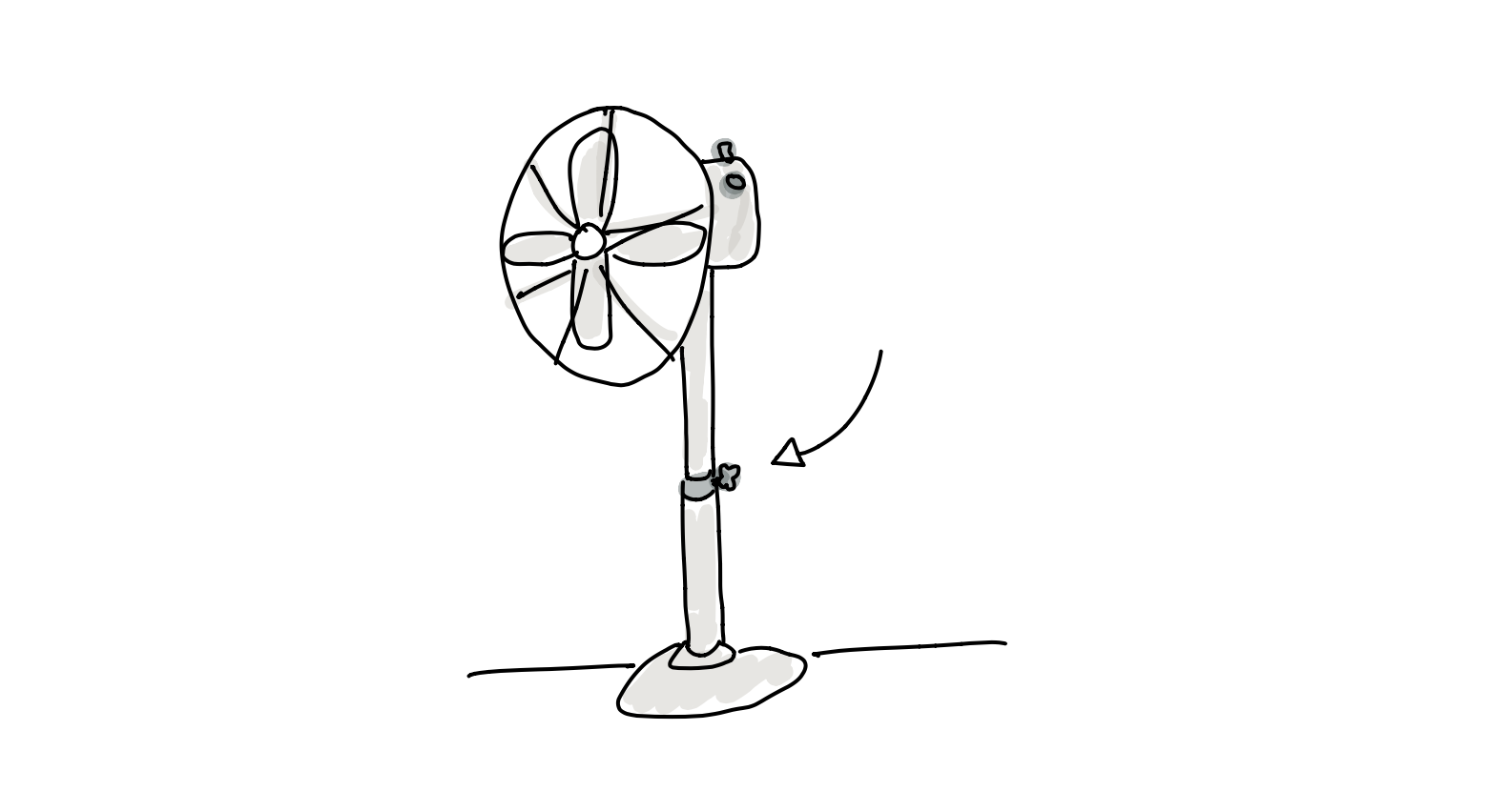 The height control takes advantage of the perceived affordance that screw handles are for turning with the convention of clockwise, anticlockwise for the loosening and tightening to lock in the height. So far so good.
Knob for changing speed
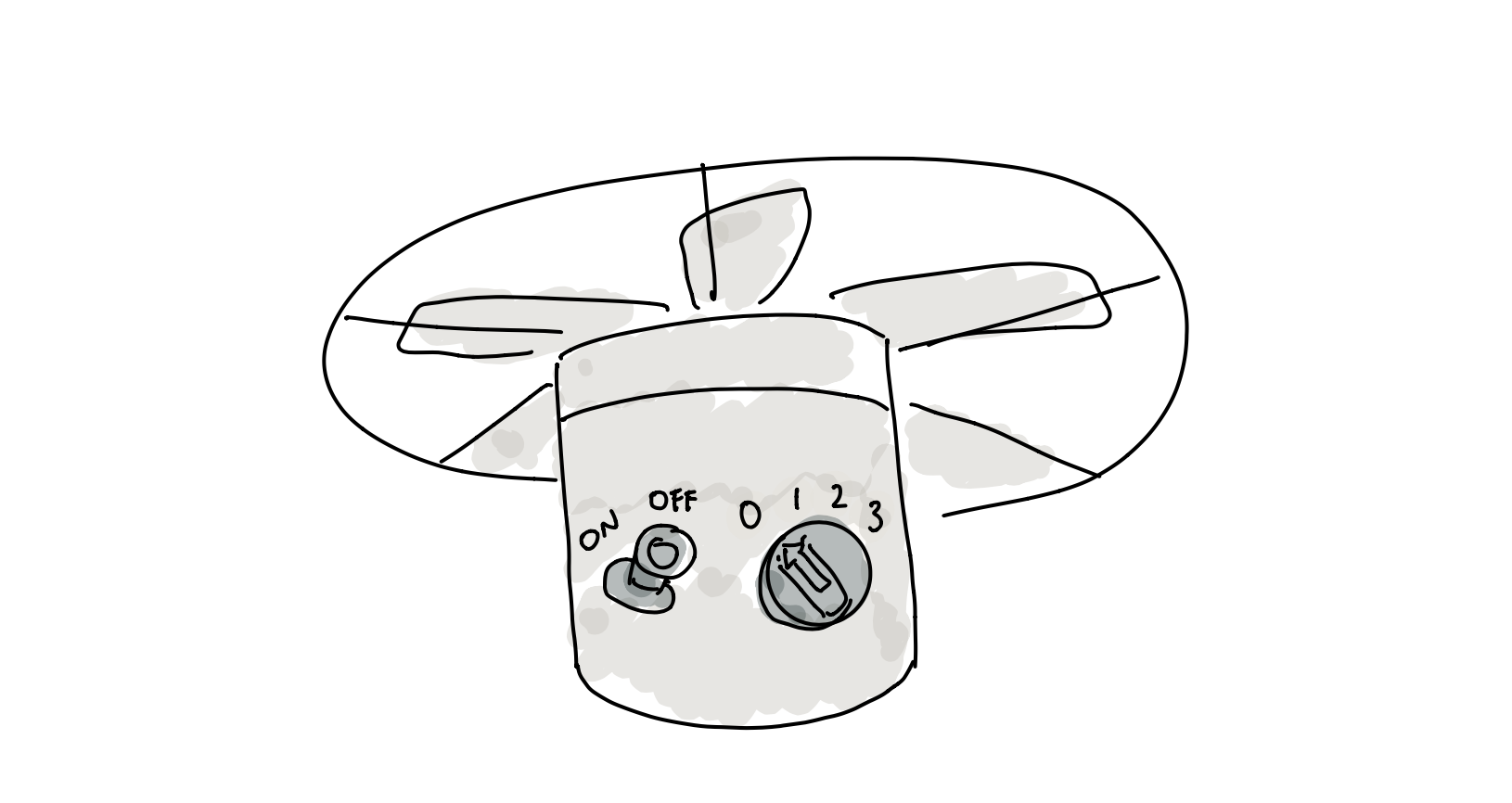 The speed control knob also takes advantage of the perceived affordance that knobs are for turning. The convention of numbers and turning from left to right indicates the level of power. The arrow signifies the current speed. The deliberate choice of the number zero limits the need to require an additional control to power on/ off the motor. Still good.
Plug for enabling auto-swivel
The auto swivel is where the design gets confusing. The ON/ OFF signifier risks confusing the operation of the swivel with the power of the fan itself. Whilst a plug has a perceived affordance of pushing and pulling, convention is not clear as to which is ON/ OFF (ask around). I am always confused with my swivel.
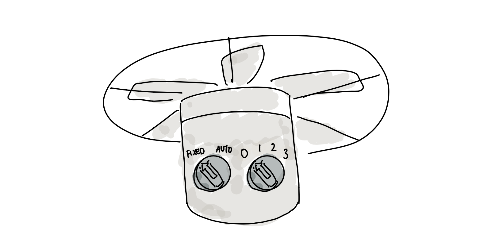
An alternative design could be to use the similar knob control for speed with a text signifier of FIXED/ AUTO.
Accidental Affordances & Signifiers
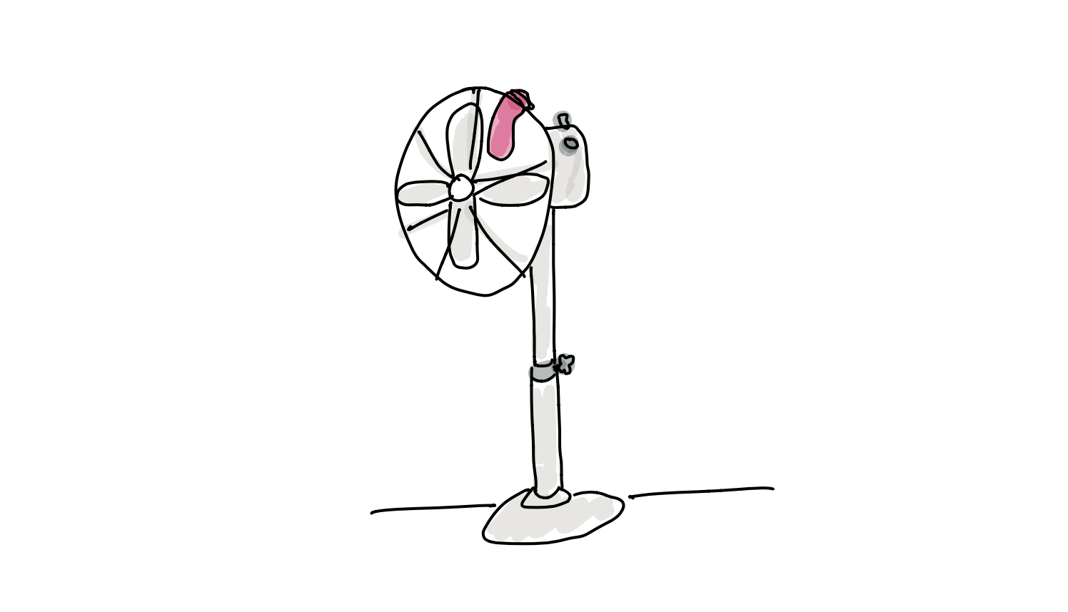 Affordances and signifiers can also be accidental. Take the image above of a sock placed on top of the fan. It signals the affordance of the fan also being able to be used as a clothes drying stand. Be aware of these signs in products and explore designs to prevent or promote unintended use cases.
3. Mapping
Mapping is the spatial relationship between two separate things.
Controls should be close to the items being controlled. Our fan passes this design test. The speed, power and swivel controls are on the fan motor and the screw handle is at the center of the stand.
The natural mapping of left to right for speed control is also good.
4. Feedback
Immediate or timely feedback is important to communicate to the person what has just happened and what they should do.
The sound of the fan getting louder is a cue that turning the knob to the right increases fan speed.
The movement of the motor when the plug is pushed or pulled is a cue whether it is in FIXED or AUTO. However, this is difficult to perceive as there is a delay which prompts me to push up and down, shaking the unit and further confusing whether it is auto swivelling. Yes I hate this plug.
5. Conceptual Model
Conceptual models are how we understand an object to work based on our past experiences or what has been communicated to us.
Most people are familiar with fans and do not require an operating manual. Our fan has good signifiers and perceived affordances to help us understand and navigate its controls.
However, take a Dyson fan. It relies on a remote which if lost requires the person to press and hold a button at the base of the unit to turn the speed up to maximum and then down to mininmum. This is a deviation to the prior conceptual model and has caused much consternation amongst Dyson owners.

YouTube User Friendly Product Design
Let us look at the mobile design for the globally popular YouTube app. We will apply the 5 key principles of design to recognize deliberate design decisions.
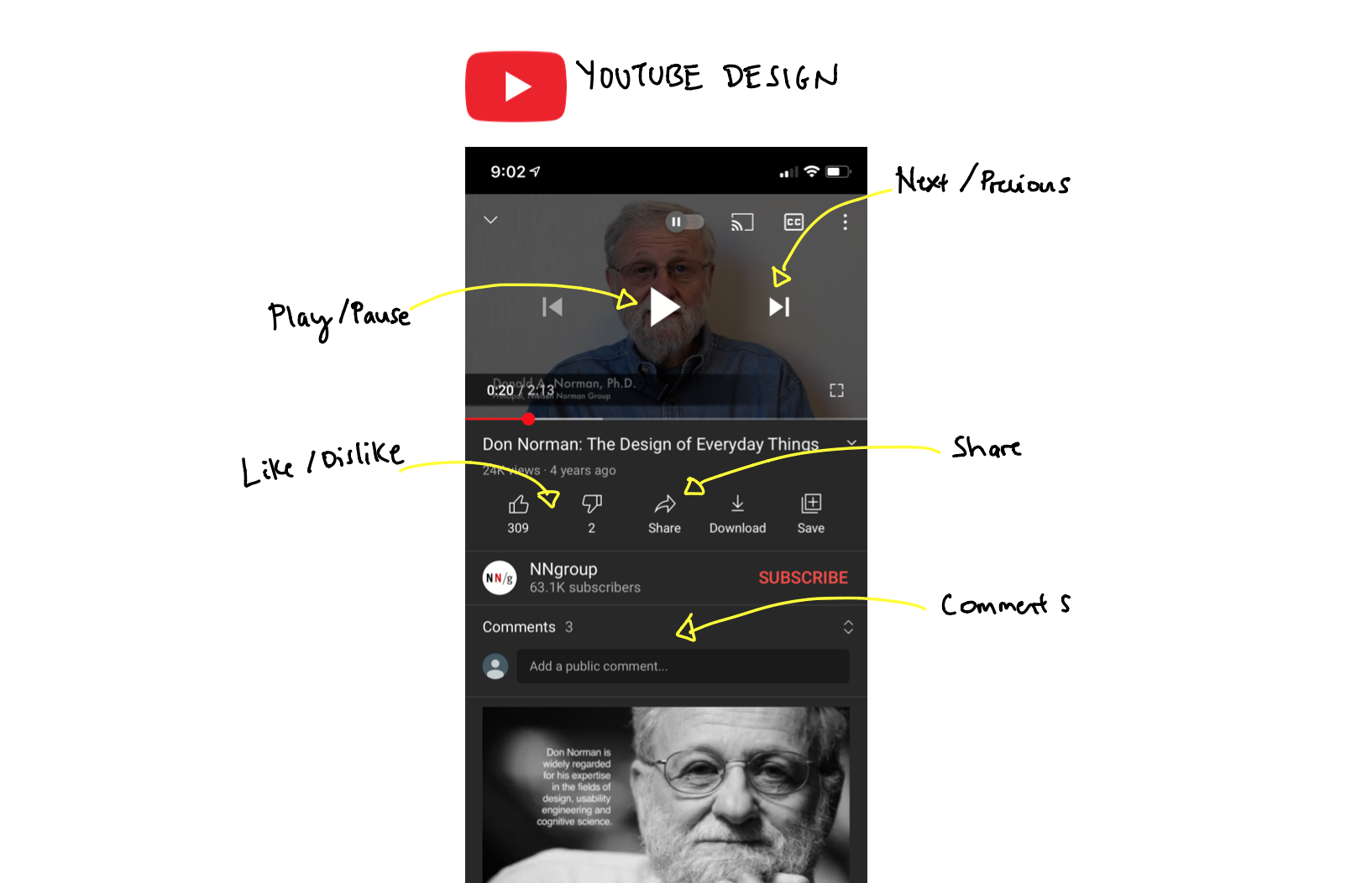
| Affordance | Signifiers |
|---|---|
| Play/ Pause | Toggle play and pause icon |
| Next/ Prev Video | Backwards and Forward arrow icon. Natural mapping |
| Comments | Comment count and expand icon inviting viewing. Placeholder inviting users to post. Sometimes it previews the most popular comment (YouTube spends a lot of time growth hacking comments to drive user engagement) |
| Like/ Dislike | Thumbs up and down icons. Convention pioneered by Facebook (don’t reinvent the wheel) |
| Share Video | Icon with explicit text. There is no standard convention between Android, iOS and Microsoft users as a share icon. For important features, when in doubt, be explicit. |
In addition to the affordances above, the mobile app has hidden affordances of being able to fast forward/ backwards 10 seconds by double tapping in the natural mapping direction. Also if you click and hold a video it will open its features for you to stop following or not be interested in a video. These are useful features that are found through discoverability of active users.
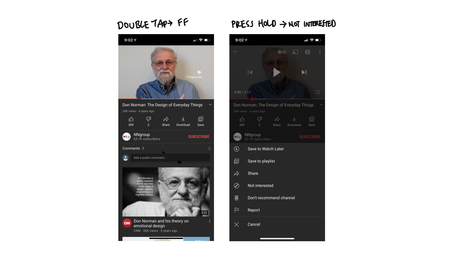
This is likely a YouTube design decision to hide visible signifiers that allow users to reduce their watch time and skip channels. By understanding user friendly design, you are also able to design unfriendly experiences to increase friction for features you may wish to dissuade people to use.
References:
The Design of Everyday Things by Don Norman - Learn more about the above 5 key principles of design and the two additional principles of Discoverability and Constraints.
Want more tips?
Get future posts with actionable tips in under 5 minutes and a bonus cheat sheet on '10 Biases Everyone Should Know'.
Your email stays private. No ads ever. Unsubscribe anytime.
My other project
Investor Tool
World's largest tech companies