How to visualize time series data - 4 key charts
2 minute read | Feb 15, 2025
finance, management
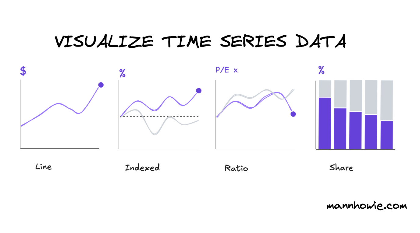
Here are four example charts to use to visualize and compare time series data.
We will apply these charts to analyze Google’s share price performance, valuation and market share over time.
1. Line chart
Line charts show trends over time. Use markers to call out key data points and avoid overuse of segments.

2. Indexed chart
Indexed charts compare relative performance of multiple segments. Normalize all data to a common baseline and date, for example 0% share price gain from 5 years ago. Label your segments and benchmarks clearly to compare performance over time.

3. Ratio chart
A ratio chart compares two variables over time on a like-for-like basis. It’s ideal for tracking valuation metrics like P/E ratios, helping assess whether a stock is cheap or expensive relative to peers and historical benchmarks.

4. Stacked share chart
A stacked share chart tracks how segments contribute to a whole over time, such as ad revenue share across platforms. Use percentage labels for clarity, but consider total market growth, not just share shifts.

Want more tips?
Get future posts with actionable tips in under 5 minutes and a bonus cheat sheet on '10 Biases Everyone Should Know'.
Your email stays private. No ads ever. Unsubscribe anytime.
My other project
Investor Tool
World's largest tech companies